Sant’Angelo monastery in Milan
Published as Pragmatic geometry, The Sant’Angelo monastery in Milan in: Oase #92, 2014, together with Joost Hovenier
 Giovanni Muzio (1893-1982) is seen as the key figure in the Novecento movement in Milan. Novecento put the architectural tradition of Lombardy centre stage, both at city and building level. Today Muzio’s work would probably be described as ‘architecture of the city’. The Sant’Angelo monastery, which Muzio designed in 1939, illustrates the evolution of his approach to the city, architectural form and construction techniques.
Ca’ Brutta
In his standard work Modernism in Italian Architecture 1890-1940 Richard Etlin distinguishes between decorative and geometric Novecento architecture.1 He traces the origins of the decorative Novecento to the post-WWI period when, in their joint studio, the architects Giovanni Muzio, Guiseppe de Finetti, Mino Fiocchi, Emilio Lancia and Gio Ponti turned their attention to the rhythms and equilibrium of the classics.2 Giovanni Muzio was the most prominent of the five. In 1921 he wrote: ‘Today again it seems necessary to react against the confusion and the exasperated individualism of contemporary architecture and to re-establish a principle of order by which architecture, an eminently social art, should especially be continuous with a country’s stylistic characteristics.’3
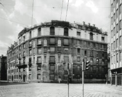
This call to arms was followed in 1922 by the design for an apartment block in Milan, which was soon nicknamed Ca’ Brutta (ugly house).4 It was a speculative project, profit maximization was paramount. The dimensions of the façade openings were fixed, since the windows had already been ordered when Muzio accepted the commission.5 Instead, the design provided the appropriate massing as well as the decoration of the façades. Ca’ Brutta is made up of two blocks which are connected by an arch. The buildings are articulated by both vertical and horizontal mouldings. The façade is a riot of colour, decoration and the odd column and loggia, ‘adapted only from our classicizing elements from the sixteenth to the nineteenth centuries but without a strictly archaeological character’.6 The finishing, colours and textured decoration, in particular, contribute to the effective scaling of the buildings. There is only a partial convergence between the stacked, quasi-classical orders and the point access dwellings. Ca’ Brutta is sometimes referred to as an encyclopaedic or kaleidoscopic building,7 and its architect undoubtedly borrowed freely from the residential architecture of the European metropolis. Milan had expected a palazzo but was given a house, Muzio once remarked. It may be closer to the mark to say that the city was given a set of stacked houses. At the time the construction site was situated among gardens outside the city’s old fortifications and as such not automatically part of the metropolis. It could be said that Milan received a surrealist reflection of its grittiness: ‘a city within the city’.
As its flagship Ca’ Brutta showed Novecento at both its strongest and weakest. While the building established the movement’s reputation, strict classicists thought its exuberantly encyclopaedic character clashed with the serenity of its classical architecture. Besides, the modernist rationalists were increasingly wiping the floor with Novecento. In this context Terragni spoke of a lack of seriousness and architectural solidity.8
Catholic University
Around 1930 Muzio’s oeuvre took a turn. The origins of the geometric Novecento can be traced back, again according to Etlin, to the entrance building for the Catholic University which Muzio designed in 1929. A monumental brick gallery connects the building to the arcades of the monastery designed by Bramante. In terms of type, proportions and materials, Muzio built on the old brickwork architecture of both the monastery and the adjacent Chiesa di Sant’Ambrogio. But stylistically it marks a rupture with Muzio’s earlier work: the classicism has been modernised. The entrance building’s façade is given stacked classical orders, signalled by a delicate relief of arches, pilasters and mouldings in the same shade of brick. The dimensional system of the concrete supporting frame is alluded to in the façade cladding, although the concrete itself remains invisible on the outside.
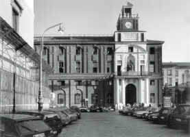
A natural stone portal marks the entrance to the gallery. Not only does the portal stand out against the main building because of its pale colour, but structurally and stylistically it is also quite distinct from the main mass. The natural stone represents the building’s monumental quality against a background of neutral, traditional Lombard brick.9 This is an old architectural law which is also observed in Dutch classicism for example. But whereas the brick background itself tends to remain unadorned in Holland, Muzio has taken special care to articulate the brickwork. Once again, the result is an encyclopaedic ‘city within a city’. The university building, Bramante’s courtyards, the church, the gallery, the portal and the entrance building are distinctive elements in an ensemble. But in contrast to Ca’ Brutta, the encyclopaedic character is entirely organic and historical. The entrance building seeks to relate to the religious ensemble and less so to ‘the city as a whole’.
Palazzo dell’Arte
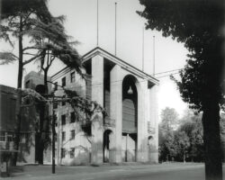
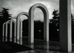
The Palazzo dell’Arte followed in 1933. This building too makes a virtue of foregrounding its constituent parts. The exhibition space makes up the bulk of the mass. The building consists of a concrete structural frame made of columns, beams and floors that make dramatic appearances here and there in the interior. Like the university, the entry zone and the pergola in front of the restaurant are made of lightly coloured natural stone. Brick mouldings and columns again reflect the dimensional system of the concrete skeleton. The Palazzo della Pilotta in Parma (ca. 1583) is an even more obvious precedent here than for the university. There are stacked orders, but this time they are even less literally classical. The façade motifs have been reduced to complex grids. The natural stone sections, on the other hand, are bigger and even more autonomous. The garden features a succession of natural stone arches that are literally and figuratively separate from the main building.10 The Palazzo dell’Arte has been constructed with German-style industrial clinkers.11 The relationship between ‘the rhythms and equilibrium of the classics’ and ‘a country’s stylistic characteristics’ is far from a simplistic repetition of Lombard tropes. Insofar as Muzio’s work can be seen as regionalist, it is certainly not the kind of regionalism of ‘doing as the neighbours do’. The hand of the designer of the recalcitrant Ca’ Brutta is still very much in evidence. Both the university building and the Palazzo dell’Arte originate in the ideas and icons of the European metropolis around 1930.
With these two buildings Novecento gained ground on modernist rationalism which was flirting with industrial construction methods. Novecento’s approach evolved into a different kind of rationalism, ‘that of the frankness, logic, and Latin evolution of a classical basis,’12 or else ‘the last attempt at rescuing the Neoclassical’.13 ‘In Muzio’s approach to design, form must be seen as the crucial element in a rationalism that alludes to a historical style, to a shared idiom, to something that can never be reduced or simplified to the needs of industrialisation.’14
Sant’Angelo monastery
The design of the Sant’Angelo monastery got underway a decade later, in 1939. In the interim Muzio had worked on bigger and smaller housing projects. In fact Muzio became an oeuvre architect whose designs cross-referenced one another but who also took his inspiration from their particular location in the city. Muzio continued to develop the gridded brick façade and the free-form concrete skeleton just as he continued to reflect on Milan’s urban development. As he liked to quip in family circles: ‘Fortunately I’m an urbanist’.15 The monastery is a prime example of, in today’s terms, Muzio’s ideas about tectonics, his handling of a hybrid programme as well as his approach to the ‘architecture of the city’.
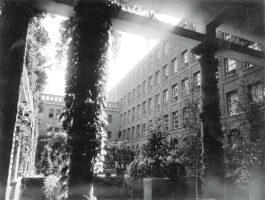
The building Muzio designed replaced a monastery complex which had been destroyed during World War I and he also restored the adjacent Chiesa di Sant’Angelo. The new monastery’s varied programme included a chapel, offices, a refectory, a library, cells for the monks and an autonomous Angelicum, effectively a theatre capable of hosting a range of shows. Muzio started with an oblong cloister court which more or less covers the area where one of the three courtyards of the ruined complex had been. The new cloister court is almost the same length, but a little smaller in width due to the construction of a new road on the site of the former monastery. The cloister court is bordered on three sides by an ambulatory; the monastery’s main passage is approximately the same width and could be seen as the fourth, enclosed ambulatory.
The monastery follows the perimeter lines of the Corso di Porta Nova and the Via Renza Bertoni, with its block forming a square with trees and a fountain in front of the church. The monastery entrance is in the corner of the church square where church and monastery meet. The cloister court is symmetrical in relation to the side of the church. The long main passage between the road and the cloister court provides access to the refectory on the ground floor and the cells on the upper floors. The cells have windows opening onto loggias, which in turn are shielded from the street by a mock façade with arches. The Angelicum abuts one end of the monastery like an autonomous cubiform building.
Dimensional system
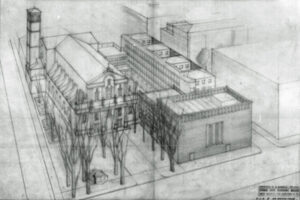
A preliminary design from March 1939 outlines the spatial concept. The Angelicum is drawn as a sparsely articulated box with symmetrical façade openings. The cloister court features an evenly spaced colonnade whose dimensional system is independent of that of both the church and the other parts of the building. A synthesis followed after April 1939. The monastery complex now appears as a geometrically ordered whole. Plans, sections and elevations are based on shifting and interfering grids. Three axial lines across the entire building organize it breadthways. In between, the various parts of the building develop their own dimensional system. That of the cloister court is linked to the new building by L-shaped brick columns at the corners of the colonnade, whose forms are reminiscent of the corners where the ambulatory meets the main building, and by brick piers, with a clock, at the short axis of symmetry. Two of the three continuous axial lines converge with the cloister court’s dimensional system. The middle one converges with the façade of the main passage and the cloister court’s two corner columns, while the other converges with the last of the round middle columns. The result is a complex interference between the dimensional systems around the cloister court. The entrance, for example, is based on the dimensions of the cloister court.
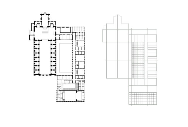
Lengthwise the dimensional system is even more complex. The Angelicum is an almost perfectly square grid. At first sight, the monastery building’s dimensions seem confusing. The width of the patios and the cell wings on the upper floor are not quite the same. The explanation for this lies in the geometry of the cloister court. The exterior patio façades are aligned with the façade piers between the ambulatory and the cloister court. In other words, in many places the geometry is generated by what the eye expects and not by the abstract logic of structural modules. The cloister court’s colonnade, for example, boasts three different modules. Only the symmetry across both central axes is perfect.
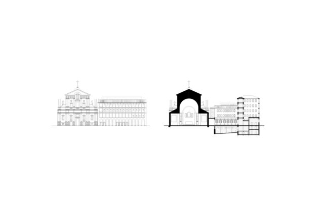
The elevations follow a similar strategy. The position of the horizontal mouldings mirrors that of the pilasters on the church front. The monumental size of the bottom pilasters must have been deemed unsuitable for the monastery programme. The distance between the head of the bottom pilaster and the foot of the top pilaster serves as the floor height and has been used to rescale the ground floor. The first and second storeys are marked by mouldings across all parts of the building. Their articulation varies, as does the elaboration of the upper and lower levels. The Angelicum boasts heavy arches that follow the recessed façade cassettes of the monastery’s upper levels. The lower part of the building has a more flexible and utilitarian façade. The façades sport four bays of windows by the patios and five bays of windows by the cell wings. The four-window configuration follows the geometry of the cloister court, while the five-window configuration is necessary to provide the central corridor in the cell wing with a window. The arch motif has been modified in the bottom row of the middle patio to make room for a vaulted ceiling in the refectory below. The various parts of the building produce greater and smaller staggerings in the façade. It could be argued that the relationship between the pale church front and the monastery complex is comparable to that between the natural stone entrance and the Catholic university complex from 1929. At any rate the church and monastery are bound together through its geometry.
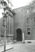
It is the pragmatism of Sant’Angelo’s geometry that sets it apart from the Palazzo dell’Arte. Muzio is known to have referred to the latter building as a container. Its dimensional system was generated by the concrete skeleton and then taken as far as possible and to monumental proportions. The monastery, however, has a hybrid supporting structure which is only visible in places. The larger spans of the Angelicum and the refectory have been constructed using barrel vaults and coffering and make no technical statement whatsoever. In contrast, the round columns on the grid of the cloister court are made of natural stone. A sole natural stone obelisk marks the entrance to the monastery. Its freestanding position in front of the façade has been prompted by the staggering between the monastery grid and the church. The obelisk mirrors the pinnacles on the church façade.16 It is the ultimate reduction of the recalcitrant layer of natural stone that characterises Muzio’s oeuvre.
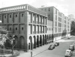
The brick background is developed more freely. The Sant’Angelo building boasts a diverse range of brick patterns: panels, columns and upright courses form arches, cornices and architraves and greater or smaller staggerings in the façade. The Angelicum’s lyrical supporting structure has prompted a gridded façade which reflects the internal structural and spatial layout. Where the building’s supporting structure cannot be seen in the exterior the façades are much simpler and only hint at the space behind through staggerings in the façade. In 1958 the Angelicum was topped with a roof structure designed by Muzio. At the same time the elevation was fitted with an extra row of façade cassettes. The band of rounded arches was reconstructed in the original way. The rooms behind it are completely aligned with the gridded façade.
Some reflection on Etlin’s categories is in order here. Just as decorative Novecento architecture rested not only on Ca’ Brutta, but also on a succession of far more academic designs, the geometric Novecento (at least in Muzio’s case) evolved in its approach to ‘the rhythms and equilibrium of the classics’. Sant’Angelo’s pragmatic geometry shifted the architectural and structural modularization from the structure’s central axes to the exterior dimensions of the brick facing. The architect’s otherwise detailed working drawings show only the contours of the walls and floors. Unlike the working drawings for the Palazzo dell’Arte, neither the specifications nor the measurements have been given for the supporting structures. The contours only roughly adhere to the modular brick size. Neither horizontal nor vertical dimensions have been specified. The space between the supporting structure and the brick shell has probably been filled with cheaper stone-like material or mortar.17 It must be borne in mind that the architectural drawing in Italy around 1940 was based on an entirely different division of labour compared to today’s international building sector, in which the architect can micro-manage a project from a distance through detailed specifications. Muzio had a small number of co-workers and was on the building site in person, so he was able to direct the implementation of his design and also draw on local know-how for practical issues, provided they fell within the design remit. All in all Sant’Angelo’s brick cladding is nothing like the hermetically modular Gemeentemuseum in The Hague, which was designed by Muzio’s role model H.P. Berlage.18
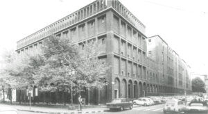
Sant’Angelo’s geometry offers a rationalised framework for the sensory experience of the materiality, the tactility, the proportions and the light that keeps playing with the textured façade. The Sant’Angelo monastery still invokes the idea of a collection of buildings with stacked orders, which have characterised Muzio’s work ever since Ca’ Brutta, and is also redolent of an encyclopaedic building. And while the building cannot be reduced to its constituent parts, the façades do not conceal them either. The interior cannot always be read from the exterior. By its nature, a monastery is an introspective place. If we reject the commonly accepted post-Jane Jacobs concept of urbanity – as the permanent, intensive and reciprocal relationship between the interior and exterior in which immaterial, transparent façades are expected to celebrate the spectacle of the ever-vibrant metropolis – then Sant’Angelo is a Milanese building like so many before it: casually monumental, massive, solid, mysterious even and prepared for a long future of changing uses, erosion and elegant decay. Its programme is as hybrid as its supporting structure, but all of this variation is mitigated by the building’s urban appearance. It is both a tectonic exercise and an urban ideal. The building may serve as a point of reference for contemporary brickwork architecture in which the cladding is taking on more of a life of its own due to thermal insulation requirements until little more than a brick dress remains.19 Sant’Angelo suggests that this trend need not result in buildings dissociating themselves from age-old tectonic principles and urban ambitions.
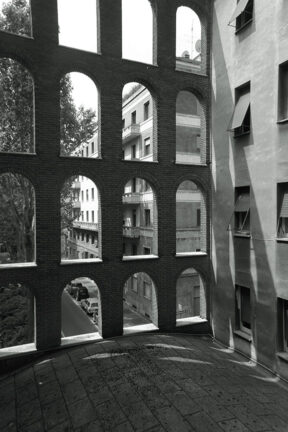
With thanks to Giovanni Tomaso Muzio and Anna Tabellini
Notes
1 – Richard Etlin, Modernism in Italian Architecture 1890-1940 (Cambridge, Ma/London: MIT Press, 1991, 165. See also: Annegret Burg, Stadtarchitektur Mailand 1920-1940 (Basel/Berlin/Boston: Birkhäuser Verlag, 1992)
2 – P. Mezzanotte, in: Etlin, Modernism in Italian Architecture 1890-1940, op. cit. (note 1), 165
3 – G. Muzio, in: Etlin, ibid., 165
4 – Muzio is the subject of two monographs: Fulvio Irace, Giovanni Muzio 1893-1982 / Opere (Milan: Electa, 1994) and Franco Buzzi Ceriani et al., L’architettura di Giovanni Muzio (Milan: Abitare Segesta, 1994)
5 – Etlin, Modernism in Italian Architecture 1890-1940, op. cit. (note 1), 176
6 – Ibid., 174
7 – Ibid, 176
8 – Ibid., 328
9 – Irace, Giovanni Muzio 1893-1982 / Opere, op. cit. (note 4)
10 – This building has been extensively documented, Leonardo Fiori, Giovanni Muzio, Palazzo del’Arte (Milan: Abitare Segesta, 1982)
11 – Interview with Muzio, in: Fiori, ibid, 22-24
12 – Antonio Nezi, in: Etlin, Modernism in Italian Architecture 1890-1940, op. cit. (note 1), 336
13 Giuseppe Pagano, in: Etlin, ibid., 343
14 – Leonardi Fiori, ‘Muzio and the Palazzo dell’Arte’, in: Fiori, Giovanni Muzio, Palazzo del’Arte, op. cit. (note 10), 36
15 – A well-known phrase in the Muzio family of architects. Giovanni Tomaso Muzio in conversation with the authors, 28 August 2013
16 – In various preliminary studies Muzio sketched the church’s geometrical outlines. The pinnacles, however, were drawn in great detail
17 – Giovanni Tomaso Muzio (note 15)
18 – In Muzio’s later buildings all facades are made of brick slips. Doctoral research Francesco Primari, La costruzione della cittá, Le case Bonaiti e Malugani di Giovanni Muzio a Milano (University of Venice, 2012)
19 – ‘Brick dresses’ was the working title of a study of the relationship between the brick cladding and the main structure of buildings, it was carried out by Jan Peter Wingender at the Amsterdam Academy of Architecture. Jan Peter Wingender (ed.), An exacting material (Amsterdam: Architectura et Natura Press, 2014)