Weeber’s Library
Published at: website Love 80’s architecure, 2017
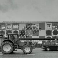
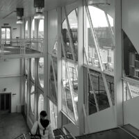
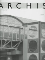 In January 1986, the first issue of the magazine Archis came out. No doubt it had sought a strong image for its cover. On it was a detail photo of a Carel Weeber designed metro station in Spijkenisse. The distressing palette of primary colours and shades of green and the bold infrastructural detailing attracted a lot of attention at the time. Weeber realised three metro stations in Spijkenisse that looked completely different. The formal language was of the time: softline with a slight hint of Louis Kahn. They were unambiguous infrastructural works. The metro stations featured manifest roofs that offered comfort to waiting passengers and made public status clear. The different renderings of the stations stemmed from the totally different characteristics of the site where they were built.
Sometimes people judge Carel Weeber’s oeuvre harshly. It is said to be careless, sloppy or unnecessarily brutal. It can be established that at least for the metro stations, that judgement does not apply. Apart from being a forgotten highlight of his work and perhaps a tipping point in his office’s vast output, these buildings shed light on the controversial 1977 design for the Central Library in Rotterdam. That design caused quarrels well into the 1980s between three architects involved in the competition for the library: Carel Weeber, his opponent Jaap Bakema and jury member Aldo van Eyck. Van Eyck was one such person who judged Weeber’s work in general and this library in particular harshly.
Why, really?
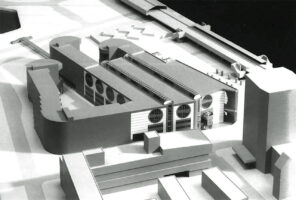
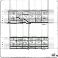
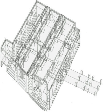
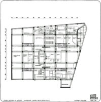
Carel Weeber proposed a three-part mat-like plan. Elongated voids intersected the building, allowed daylight and provided clear routes through the building. The supporting structure and facades had large circular openings, unmistakably borrowed from Louis Kahn’s architecture. The library would conform to the grid lines of the residential block into which it would be inserted and give structure to it, but, through the monumental treatment of the façade, evaded the aesthetics that would be enforced by the residential programme. Several details echo the softline design of the metro stations. All in all, the design exudes a high degree of discipline. Public qualit speaks from the spatiality and monumentality of the facades. What is absent for once is the search for a form that would be improper to the library and the logic of the city’s building grid.
Compared to Weeber’s proposal, the library realised by Bakema is hyperbolic. Bakema, with apparent approval from Van Eyck, aspires to dominate the urban form with his building and reorder it on a micro level. Three decades later, Winy Maas would adopt the same technique for the Market Hall in Rotterdam. Deliberately, the mass of the building is enlarged. Where Weeber assumes facades that govern the relationship between street and public interior, public interior spaces are linked to the public domain via obvious axes. Where Weeber recognised that buildings have thresholds and doors, Bakema (again like Maas) relied on the transparency of the façade, the constant optimistic interaction between building and street and the absence of security regimes.
It is speculative how Weeber’s library would have appeared in built form. If the repertoire of metro stations had been followed, the building’s facades would have been made of plastic panels with the same wrenching colours. Huge round windows would have intersected these panels. As a secondary personal statement, a bay window with a glass dome would have been built at the corner. The entrance was on the Binnenrotte, indicated by three thick columns that would repeat like small sculptures on the pavement in front of the library. If the library had indeed drawn from the repertoire of metro stations, it would have transformed Louis Kahn’s architecture into a completely contemporary Dutch idiom of steel, glass and plastic.
Video
Watch video registration of an interview with Carel Weeber by Job Floris and Hans van der Heijden here
