Šik
Published in: Hans van der Heijden, Architectuur in de kapotte stad (THOTH), 2008 (English translation Oase #76, 2008)
 In his film Down by Law director Jim Jarmusch tells the story of three characters whose lives briefly and accidentally converge. The plot is simple. One night pimp Jack and DJ Zack are doing some shady deals in an unnamed American city. They meet in a prison cell, where they are later joined by Roberto. When the three decide to break out they embark on a gruelling trek through a swamp that is as vast as it is desolate. Upon their return to the civilised world, their ways part again. The film is hardly a character study. Down by Law presents us with blatant big-city kitsch. Clichés are rife. The prison cell is your typical American shared slammer with a steel fence frontage, while the American slum is everything you had imagined it to be. Robby Muller’s black-and-white photography is grainy and accompanied by the raw neo-blues of lead actor Tom Waits. But there is more to the film than mere atmosphere or caricature. Jarmusch follows his characters’ attempts at appropriating their harsh surroundings. We see Zack displaying his lack of power by kicking cans across the street. He appropriates the city by sitting on its curbs and leaning against streetlights. In his cell, which is dirty to begin with, Zack is busy drawing a calendar on the walls with charcoal. In the swamp our heroes break into a fishing hut that is indistinguishable from their prison cell. In a word, the story is unmistakably about survival: fleeing pursuers, making fire, roasting rabbits, finding shelter. The camera work is static and records how the three companions, free of any illusions, cope in a tough contemporary environment.
The perspective as meeting
The perspective drawings made by Swiss-Czech architect Miroslav Šik and his pupils bear comparison with Jarmusch’s film.1 They are hand-drawn or computer-generated studies that take their cue from the context of their designs. The reality of pylons, manhle covers and road surfacing forms an inextricable part of these drawings. Šik painstakingly reproduces the dust in the street. The light is realistic. Blue skies and human figures – let alone in the shape of fashionable skaters or gossiping mothers with prams – are absent. The new buildings that materialise against this backdrop seem to merge with their surroundings, like the charcoal lines on the walls of Zack’s cell. When I asked Šik whether the simplicity of his perspectives might not constitute an unusual form of commercial suicide, he readily admitted that his drawings are negative and melancholic, referring to the cultural conditions within which he developed after graduating as an architect: the work of Wim Wenders, the aforementioned Tom Waits and Jim Jarmusch, the nuclear disaster at Chernobyl, the austerity of the 1980s.2
Šik’s perspectives are not drawings aimed at selling a design. They are extremely labour-intensive products that lack their producer’s signature. A slow process of registration produces an understanding of the reality of a location. In Šik’s case, the perspective drawing is an unconventional teaching and design tool. The slowness and dedication required for the drawings’ technical perfection encourage an equally slow, considered and rigorous statement on the design. This deliberate slowness alone carries a hint of criticism of the inquiry into form that has become so fashionable these days. After all, the dazzling spiral and blob visuals, impressive as they are, are incredibly easy to produce. With the advances in CAD technology and the introduction of faster computers, design often means first and foremost rapid data entry. In this situation Šik occupies a traditionalist position and does so in a specific way. The melancholy in Šik’s drawings is unmistakable, but as in Jarmusch’s film these documents are more than just atmospheric impressions. You might characterise the drawing as a technique for the acquisition of knowledge.
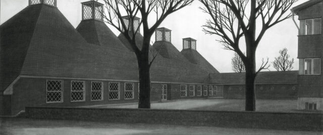
In the preliminary study for Catholic centre Sankt Anthonius in Egg, Šik presents us with a naïve picture with bare trees, a great deal of shadow, little contrast and unsaturated earth pigments. A low garden wall in the foreground suggests distance from the auteur. The sky is a clear grey. To the right, we see a building with a protruding gutter and a winding drainpipe. We also see a long building with five industrial looking domed roofs. These are covered in tiny slate roofing tiles which, like the gutter and perhaps also the façade finish, are extended to a lower structure at a right angle to the long building. The place where the two buildings meet forms the core of the composition. The diagonal glazing bars and the lantern lights have been carefully drawn. Buildings, trees and garden wall enclose a small paved square that is harshly lit. The picture reveals nothing of the ensemble’s function. Without any additional information both nature and scale of the design initiative remain unclear. This is an autonomous tableau. The conventions of the architectural drawing are absent, with old and new presented side by side. It is impossible to estimate the age of the ensemble in the drawing. It is a picture of an ecclesiastical centre, but could easily pass for a derelict shunting yard, abattoir or industrial site. Light-hearted is not a description that comes to mind. The tableau is a pithy proposal for a concrete location: a village on the northern edge of the Swiss Alps, which has the same harsh light as the perspective drawing.
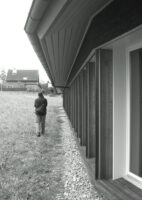
The ecclesiastical centre in Egg was not actually built in this way. The five domed roofs were replaced by an elongated gable roof, while the diagonal glazing bars are absent. I do not know if a new perspective was drawn for the eventual design. What I do know, however, is that the preliminary study contains the seeds of the architectural programme of the completed design. The spatial organisations of the two correspond. The long building that houses the new ecclesiastical centre has been further developed on a double-symmetrical floor plan with truncated ends. The ridge is made of zinc and contains the gratings needed for the service installations. The roof plane has been organically attached to the roof of an existing low building, which links the ecclesiastical centre to an old wooden church. This roof may look old, but has in actual fact been adapted (by extending the ridge) to make a traditional valley gutter at the level of the ecclesiastical centre’s roof. The façade finish consisting of small wooden slates was inspired by the adjacent village church. Distinctive details, such as the small protruding edges of horizontal connection details, reappear in the new building. These are plain architectural details that have proved their worth in the Alpine climate. At the rear of the ensemble, this consonance is strongest where the concave shapes of church and ecclesiastical centre converge. In today’s architectural practice, with its weighty triple glazing, the diagonal glazing bars of the old church building have no place and have therefore been abandoned. In its finished version, the ecclesiastical centre instead relies on the strong tectonic influence of contemporary products. This has resulted in a wooden building with a recurring series of rafters interspersed with casement windows. The interior finish is the same throughout the ensemble: a great deal of unpainted wood, wooden wainscoting, natural stone flooring, perforated acoustic panels and traditional pale green hues. Old and new do not form a contrast, but a continuous spectrum of architectural details. In Šik’s design methodology the perspective characterises the relationship between the new building and its urban reality as a meeting rather than a superimposition of one on the other.3 The relationship between the existing urban fragments and new architectural interventions is a reciprocal one.
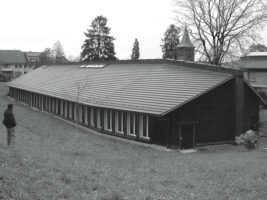
As in the preliminary study, the ecclesiastical centre does not have a form that clearly epitomises its public function. The completed version, too, tends to bring to mind agricultural or pre-industrial references. During the building process, some literal contextual references, such as the diagonal glazing bars, were toned down, whereas others were enhanced, including the treatment of the wooden slates. Of course the preliminary design could only anticipate on the practicalities of the construction site to a limited extent, and in my view the realised building is more powerful thanks to the sensible tectonic choices and the coherence of the ensemble’s constituent parts. Although the building would have been unimaginable without the preliminary study, the building process has added certain qualities. The building has come out of a growing understanding – i.e. an increase in knowledge – based on clearly formulated (or in this case: drawn) design plans. The preliminary study could be dismissed as an overly ambitious design that was never realised. However, I believe it would be more accurate to say that the drawing that preceded the building process served to define the assignment. It is, both literally and figuratively, a development perspective.
The turn to the trivial
Within Western European contextual architecture the building in Egg serves as an impressive learning tool. It is a unique assignment in a unique location. The brief to design a public building in a comparatively sensitive historical context is heroic enough to merit a place within ‘high architecture’. An essential aspect of Miroslav Šik’s position, however, is his turn to what he calls the unheroic, trivial assignment.
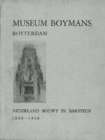
During his studies at ETH Zurich between 1972 and 1978, Šik and his generation (which includes figures such as Roger Diener, Marcel Meili, Pierre de Meuron and Jacques Herzog) were influenced by Aldo Rossi. This lengthy quote from Šik himself is quite illuminating: our direction was determined by Rossi’s realism, as well as by Grassi’s. Until about 1976 we were copying Rossi; we always drew Rossi plans and Rossi façades. There was still a distinction between typology and morphology in those days. To this day I have a great deal of sympathy for this first Rossi, the designer of the Gallaratese in Milan and the white schools in northern Italy. The publicity surrounding Venturi marked a turning point. We turned towards the trivial. And although we all went our separate ways, a certain solemnity has remained a constant. Ex negativo: Krier’s postmodern irony did not have a place here. At the time it was customary at the ETH to carry out extremely lengthy research and to work as an assistant. When I worked as Fabio Reinhardt’s chief assistant I was always on the look-out for other sources. To me, these were the other modern architects, such as Dudok and Eschauzier, not the CIAM modernists. I visited the Netherlands and started looking for the work of the architects featured in the book Nederland bouwt in baksteen [Brick buildings in the Netherlands], which I had picked up somewhere. But I also looked at buildings and viaducts that had not been made by architects. I was developing an interest in the profane and the non-specific. This was the time of Architecture without Architects. I dropped the typological aspect first. Classic regional solutions ought to be mixed with other styles. Herzog does so beautifully, but in a place where the styles are not indigenous. That’s not right. It reminds me of Zumthor’s wooden shingles in a village where everything is made of stone. It has a vulgarising effect. Visually, it is absolutely beautiful, but also provocative and in the wrong place. There is no need for alienation! My style lies somewhere between Venturi and the early Rossi.4
The group Analoge Architektur, which Šik founded in 1987, continued part of Aldo Rossi’s programme at ETH Zurich.5 The group’s manifestos and projects were exhibited in Paris, Berlin, Strasbourg and Vienna. In 1999 Šik became professor at the ETH Zürich. His essays were published in the 2001 collection Altneue Gedanken, Texte und Gespräche 1987-2001.6 Like his drawings, his texts are austere in tone, written in a harsh, archaic-sounding German. The texts speak for themselves. Within the scope of this article, it is important to note that Šik is an unabashed traditionalist. Šik’s writings outline this position in increasing detail: ‘Conservatism is afraid of change. As a traditionalist, however, I am not interested in saving, but in fusing. Tradition that fails to constantly renew itself is doomed.’7


Šik’s ideological agenda is neatly encapsulated in his own term Old-New.8 His turn to the trivial takes shape in a series of buildings that have a far less sensitive physical context than Egg. The musicians’ house in Zurich is an interesting case in point. It sits on a narrow strip of land in a 1950s suburb and is surrounded by modern apartment blocks and industrial buildings. This part of town is characterised by the orthogonal system of streets, front gardens and courtyards and not by its edifices. The musicians’ house faces the street and follows local building lines and building heights, yet creates its own internal context. The street elevation is flat and grey. The rear is pale yellow and encloses the free-form gardens around which the living rooms are set. The building’s floor-plan is unusual. The homes are arranged around an access deck, onto which the homes’ balconies open out. Each home has two front doors opening out onto the access deck: one leading to a sound-proofed music room, the other to the balcony. The balconies feature the entrances to the actual homes. By making the balconies an integral part of the building’s routing and by having them so clearly face the garden, they form the building’s spatial axis. The homes themselves have been designed as a succession of more or less square rooms. There are hardly any corridors or elongated and amorphous spaces.9 From a tectonic point of view, the building is very straightforward. The building has load-bearing walls and is made of the unspectacular materials that are available in Zurich. Šik’s buildings are ‘middle-tech’. [10]
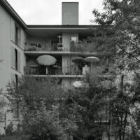
The window frames at street elevation are a tad smaller than those facing the garden. The entrances to the access decks are below street level and afford a glimpse of the gardens. The decks’ fences feature cartoon-style images of musical instruments. The gardens’ distinctive look is created by newly planted greenery, half-open French balcony doors and outside spaces with plants, chairs and drying laundry. Whereas the front elevation seeks to negotiate public space with understandable architectural and iconographic means, the rear features the kinds of scenes created by everyday life. Again, we are reminded of DJ Zack who appropriates his living space with languid gestures.
Operational traditionalism
The two projects at the centre of this text are the product of a well-defined design methodology, one that fits the architect’s equally sharply outlined ideological framework. The buildings are autonomous and require no explanation. The reasons to examine them anyway lie in the designer’s provocatively formulated traditionalism. Martin Steinmann is of the opinion that there is not only an idealistic, form-oriented traditionalism, but also an operational traditionalism that focuses more on the design method. Whereas the former concentrates on constant values, the second is always in flux. Steinmann illustrates the latter position with reference to the work of the Dane Kay Fisker, who reconciled the fact of 20th-century mass housing with the historical city and the modern practice of building. He placed Fisker’s objective traditionalism amid the clichés of the conservative Danish farmer and the curious Danish sailor.11 Amid the achievements and opportunities of the city, the pragmatics of building and the experiment, amid nostalgia and longing, amid the recalcitrance of the existing city and the exhilaration of the modern metropolis, Miroslav Šik makes a similar attempt at linking his designs to the larger rules posed by today’s city.12 Šik is not interested in the reproduction of historical tropes or in finding personal inspiration in a particular context, but in the acknowledgement that each design is embedded in material and cultural conditions. Within this particular framework, Šik’s work might be called clinical or even impersonal. He most certainly never flaunts his expertise or artistic leanings. By contrast, Šik’s perspectives and texts open up the rules that are considered relevant to the design proposal. Instead of exploring the boundaries of the concept of traditionalism, which is something for academics, Miroslav Šik draws on an intellectual practice to interpret an updated, traditionalist view of design that seeks to be dynamic.
Notes
1 – See the catologues of student projects: Professur Šik, Nos. 1 to 4, ETH Zurich 2001 to 2004
2 – Interview 23 November 2004, ETH Zurich
3 – To paraphrase Mark Pimlott. ‘American and European ideas about space and place are entirely different: the former is forged out of system-based strategies superimposed on the World and the latter from a meeting with the World, in which resides the possibility of encounter with otherness.’ Mark Pimlott, Without and Within: Essays on Territory and the Interior, Episode Publishers, Rotterdam 2007, p. 10. In this respect, Miroslav Šik is most definitely a European architect.
4 – Ibid footnote ii
5 – Catalogue: Analoge Architektur, Edition Boga, Zurich 1987
6 – Miroslav Šik, Altneue Gedanken, Texte und Gespräche 1987-2001, Quart Verlag, Luzern 2001
7 – Ibid, p. 135
8 – Miroslav Šik is seldom omitted from reference books on Swiss architecture, but is often depicted in a one-dimensional way as an ‘ideologist’- undeservedly in my view. Jacques Lacan provides an example in: Jacques Lacan: A Matter of Art, Contemporary Architecture in Switzerland, Birkhäuser, Basel 2001, p. 20.
9 – I would like to refer the reader to a wonderful close reading of this building: Lukas Imhof, Musikerwohnhaus, in: Midcomfort, no 01/2006, ETH Zürich.10 – Ibid note 2
11 – Martin Steinmann, Die Tradition der Sachlichkeit und die Sachlichkeit der Tradition [The Tradition of Objectivity and the Objectivity of Tradition], in: Martin Steinmann, Forme forte, Ecrits/Schriften 1972-2002, Birkhäuser, Basel, Boston, Berlin 2003
12 – Wolfgang Sonne distinguishes between traditionalist architects who base their work on individualules and those who focus on larger rules. A contribution to the debate at the conference Tradition Today, organised by the Rotterdam Academy of Architecture on 15 November 2007. Sonne refers to two conflicting positions that were represented at the conference by individualist Tony Fretton and systems thinker Paul Kahlfeldt.