The Pui
A shorter, edited version appeared as: Hans van der Heijden, Transparency and Shopfronts, in: Urs Meister, Vera Kaps, Architecture & Transparency, University of Liechtenstein, Institute of Architecture and Planning, Vaduz 2018
 The Dutch language has a unique word for the international architectural phenomenon of the shopfront: de Pui. It refers to the bottom part of a front façade, which often differs from the main façade because of its cladding in a different materials or because it mainly exists of acutely crafted carpentry and glass. Stone, steel or wood columns might connect to an outdoor piece of paving.
There must have been a moment that the Dutch city, because of fire risk, could not built in wood anymore, but in brick. The resulting brick house accommodated trade, small business and dwelling. The received history of the Dutch shop window is that from that very moment the lower stories quite slowly changed. And again it this development is an international one. Windows were first enlarged and then provided with showcases. In the 19th century the phenomenon of shopping as we know it now manifested itself. The pui made its entry in architecture as an ambiguous motif. On the hand, it enhanced the visibility of merchandise to the flaneurs on the street. Merchandise was exposed within the confinement of the pui, but the pui also rendered the shop interior visible from the outside. On the other hand, the pui marked the presence of the shop within the city and expressed the character of the business and the goods on sale. In current newspeak, we would say that the pui helped to establish an urban brand. The pui was the domain architectural phantasies, not rarely in an Art Deco or Jugendstil style that heavily contrasted with the domestic world above. The lack of stylistic restrictions produced a secondary urban language which was highly flexible and operational and had little troubles forming novelties such as corner entrances.

Today, the pui seems to have almost disappeared from the architectural repertoire. Today’s shop fronts might be reduced to a plate of laminated glass with a ditto door. That is: during the day, at night such shop fronts are protected by steel shutters.
In 1963, when Colin Rowe and Robert Slutzky published their essay ‘Transparenz’, the dominance of commerce in urban life was still in the future. In their essay, they suggested a difference between literal and phenomenal transparency. One example of the first category was the Bauhaus in Weimar, where, indeed, one can easily see through its facade. Yet, the glass facade has a strong crystalline presence of its own, if only because of the heavy steel chains which are needed to operate the windows. The Bauhaus does not yet contain screens of laminated glass, ‘minimized to the max’. The Bauhaus features glazed walls, rather than glass screens.

It is not difficult to read the history of the rise and fall of The pui in a sense of cultural pessimism, nor is it difficult to take the laminated glass screens of current shopfronts as an intrinsic part of modern commerce in which architectures is expected to shine. These shop fronts are required to be transparent enough to obscure the boundaries between the public and private realm in order to enhance consummation. And it is overly obvious to qualify the shiny glass screen as the final step of the disintegration of those complex architectural system as Rowe and Slutsky argued for.
Be that as it may, it is necessary to distinct between the modern condition of commerce and the state of current architecture. The evaporation of the distinction between the public and private realm is not an issue of style. In fact, both traditionalist and avant-gardist architects are using the laminated shiny glass retail front. It is much more productive to pose the continuum of space, the evaporation of the distinction between the public and private realm, as an urbanistic problem.
It has become apparent that our cities are not only the result of typological, formal and stilistic choices, but they are also made up from concrete architectural items: doors, ironmongery, materials, textures and even colours add to a sense of street credibility of urban architecture. True, these are secondary items, appearing disconnected from the more stabile categories of architecture, including for instance type, geometry and structure. When in the 1960’s the antique city was scrutinized, it was reinstated as an architectural model in typological and formal terms. For our generation of architects that reduced reading of ‘city’ is not so much false as it is unsatisfactory. It feels so incomplete.
That is why it is provoking to interpret essays like Transparency again. To put it simple, phenomenal Transparenz means something like ‘layered space.’ The text argues in favour of that layered space by referring to no lesser examples than Le Corbusier’s controversial League of Nations competition entry. Transparenz could be taken as one of the last attempts to save architectural modernism by theorising its agenda within a the tradition of the profession. It was only later that at least Colin Rowe expressed his interest in classical architecture more clearly.
The history of classical architecture offers a rich reservoir of precedents when it comes to the design of thresholds, loggias, transition spaces, colonnades and other ‘layered spaces’. Current urban thinking and practice in urbanism should profit from such normalised reading of disciplinary precedents. Layered space, as forwarded in Transparency, lies very much at the core of urbanism. After all, the facade is not just about aesthetics and and needs to be conceptualised beyond the mythology of architectural craftmanship. Fundamentally, the façade is there as a means to city dwellers to regulate their contact with the public domain. The knowledge of the repertoire of thresholds and transition spaces is an absolute prerequisite in its conception, and in urbanism. The pui is a case in point. Recent and less recent examples demonstrate the urban values of the pui.
Current urban thinking and practice in urbanism should profit from a reading of disciplinary precedents. Layered space, as forwarded in Transparency, lies very much at the core of urbanism. After all, the facade is not just an aestheticized opportunity, but needs to be conceptualised beyond the mythology of architectural craftmanship within the reality of commerce. Fundamentally, the façade is there as a means to city dwellers to regulate their contact with the public domain. The knowledge of the repertoire of thresholds and transition spaces is a prerequisite in its conception. The pui is a case in point. Recent and less recent examples demonstrate its urban properties.

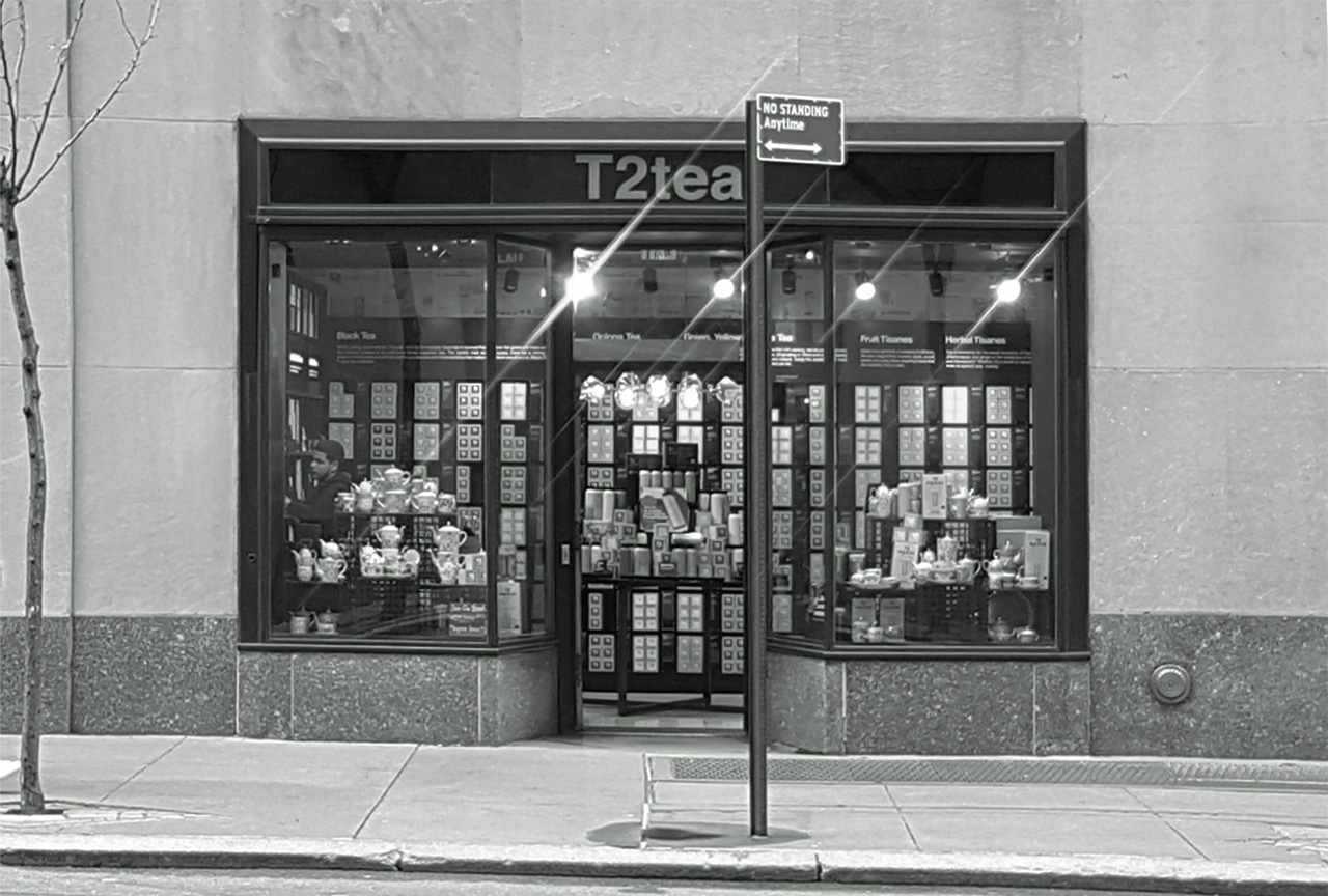
If we look at the pui in the plinth of the Rockefeller Center in New York (1929-1940), we may observe that the architect Raymond Hood succeeded in scaling this enormous high-rise ensemble to street scale by using the pui cleverly. The layered quality of that evokes an architectural threshold between street and retail which contains showcases for commerce, space to advertise, plenty of visibility of the shop, a recessed door and on top of that the shining Art Deco architectural details.

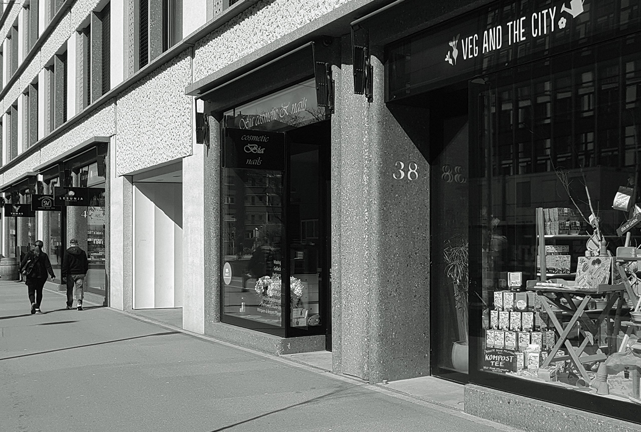
In Zürich, the architects Caruso St. John did something similar in the plinth of their Europaallee block (2007-2013). The repertoire is contemporary, but equally tongue-in-the-cheek-sensual, consisting of polished concrete and aluminium. The pui is used to form a concrete threshold on the kerb. Tiny concrete lintels project from the building, covering colourful sun shields.
The Hessenberg project for the historic centre of Nijmegen (2006-2011) has a small shop below a block of flats. The pui is used to articulate a recessed entrance, two show case windows and a small step. The concrete which frames these element also integrates a stone plaquette, the “Stammering Façade” was the local nickname, which used to represent the name of a newspaper printer, De Gelderlander.
The reassessment of such historic urban details is not an act of architectural regression. Phantastic as they appear, they are also not just nicer or ‘richer’ than contemporary architectural products like the laminated glass screen. Their shine is intentional. These occasions celebrate a certain bravado at the micro level, whilst critically illustrating Rowe’s notion of phenomenological transparency.

