House in the City
Published as: Huis in de stad, woongebouwen van Diener & Diener in Amsterdam in: De Architect, 2001
 It is a reality that urban landscapes today do not develop through homogeneous design concepts. In fragmented planning practice, coherence can only be achieved in individual building projects or enclaves.1 This is one of the themes of the book The House and the City, authored by Martin Steinmann and Roger Diener.2 The Diener & Diener projects presented in this book with an introductory text are similar in scale. Moreover, they are all projects in existing urban tissues. The last project shown is a housing plan for a site on the docklands in Amsterdam.
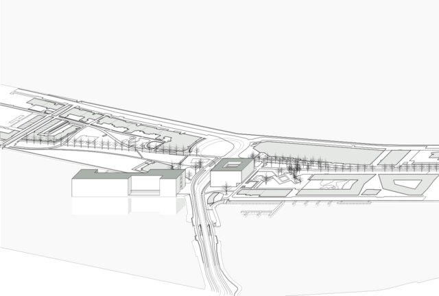
This project has now been completed. The two eight-story residential buildings are designed as monolithic box-like structures, standing firmly on the ground and clad entirely in reddish-brown brickwork. The square building, the Hofhaus, forms the pivot between the two peninsulas and has an almost square basement and first floor. The floors cantilever far out on one side.
The basement and ground floor of the long waterfront building, the Langhaus, are rectangular. On the ground floor, this houses two patios. The patio on the street is part of the access to the houses, the other is on the water and serves as an outdoor space for the entire block or for the adjacent flats. The size of the patios recurs on the upper floors as a recess in the main mass. In a simple manner, the volume of the block is articulated in sizes that correspond to the surrounding buildings. The entrances to the houses and some commercial spaces form a plinth, which differs in use and image from the above.

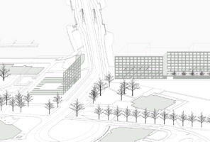
All these nuances work strongly on the islands themselves, close to the buildings. From the other side of the water, the Langhaus in particular looks like an unarticulated shape. Modulations of the volumes and a precise arrangement of the two buildings have created a series of distinct, accurately defined public spaces: an enclosed park between the neighbouring Piraeus housing (designed by Hans Kollhoff) and the Hofhaus and a small space between the Hofhaus, the Langhaus and the curved building with captain’s houses near the dam. The amorphous space in line with the dam is completely transparent, but also offers a second view perpendicular to the dam.

All this is supported by the choice of tunnel formwork for the production of the loadbearing walls and floors. The Langhaus reflects the supporting structure unambiguously. The longitudinal facades feature large window frames in a regular pattern. The end walls are closed and only reveal something of the building’s access. The structure of the Hofhaus is rotated in respect of the long building, underlining the length of the peninsula in the area behind it. Differences appear in the delineation of the surrounding spaces.3 At the amorphous central square and park, regularly placed window frames define the facades of the non-load-bearing walls. The load-bearing walls have slightly smaller window frames set in a jumping pattern.
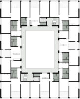
In the Hofhaus, a slab-like façade is suggested, emphasising the length of the KNSM Avenue on one side and providing the backdrop for the much smaller building at the dam landing on the waterfront. The slab has enough mass to make the boxy cantilever at the park visually acceptable. The building’s parallel concrete structure incorporates eight units per level. The rooms are approximately the same size and connected in a shifted checkerboard pattern. The dwellings facing the squares can be relatively deep due to their large window frames. The other houses are less deep, but wide. They are twosided in that they have large window frames facing the court. The latter houses in particular have beautiful labyrinthine floor plans.

The openings in the longitudinal facades of the Langhaus have deep recesses, initially reinforcing the suggestion of a column structure. The window frames stagger half a brick size per floor. At first glance, this eleven-centimetre disruption in the nearly 150-metre-long building may appear to be an artificial intervention. Again, this detail is best understood without searching for meanings, but taking it for what it is: an operation that unsettles the impression of a regular column grid. Again, it is an experience evoked only close to the building. It prevents the Langhaus from being read only on the grand scale of the harbour landscape.
All the new as well as the existing parts of this ensemble by Diener & Diener are strongly related to each other, yet remain independent. In this respect, it can be compared to Mies van der Rohe’s urban projects and Kollhoff’s Piraeus building. The relationship of Kollhoff’s building to the existing building at its heart is monumental, forever tranquilised in mutual respect. In contrast, the adjacent sheds do not participate in the composition; there is a contrast with the other harbour relics. This solitary form is emphatically sought.4 In contrast, Mies’ Federal Centre ensemble in Chicago is an ensemble that is part of two different building blocks in the grid and arranges itself in the unstable surrounding block landscape. The three box-shaped buildings are oriented to each other by simple similarities in volume, use of materials and building height. Of significant importance is also the equal ceiling height of the public areas of the two tall office towers and the low post office. Old and new buildings relate to each other in a casual way. Significantly, the famous bright red Calder sculpture that so aptly responds to the height of the public ground floor was installed only years after completion.
Like the Federal Centre, Diener & Diener’s ensemble stands on multiple lots and uses the same ordering devices. However, the articulation of the harbour islands and the diverse existing buildings and urban spaces produce a much more complicated topography. All the resulting conditions are responded to equally in Diener & Diener’s plan. No choices or preferences are articulated as with Piraeus. This has all kinds of advantages in the dynamics of the modern city. The project does not pretend to be an enclave. It does not bury itself in its own autonomy, but provides a hybrid spatial model based on general architectural schemes. It can be continued. This work is a good example of architectural urbanism.

In the Netherlands, the term luxury is quite often explained in the limited sense of excess or extravagance. Diener & Diener’s project exudes a different luxury, which has a lot to do with a very direct and intense experience of the ‘house in the city’. For instance, the huge sliding windows set low in the façade directly on the water create the sense of luxury in the sense of opulence or pleasure. It is the experience of reflections in the harbour, sea air and splashing water through the opened windows, in short, everyday reality, that evokes this realisation.
Notes
1 – Harm Tilman, Wonen in de digitale stad. Nieuw stedebouwkundig werk van Kees Christiaanse, de Architect, January 1997, p. 26-35
2 – Roger Diener, Martin Steinmann, Das Haus und die Stadt, Diener & Diener – Städtebauliche Arbeiten, Luzern 1995
3 – Steinmann, Herzog en De Meuron have pointed at the relevance of the internal differendce in the projects of Diener & Diener. See: Jacques Herzog, Pierre de Meuron, Attempts to perceive a building, in: Ulrike Jehle-Schulte Strathaus, Martin Steinmann (ed.), Diener & Diener. Projects 1978-1990, New York 1991, p. 53; Martin Steinmann, Diesseits der Zeichen, in Christina Horisberger, Annina von Planta, Stadtansichten, Zürich 1998, p. 66.
4 – Interview by Cees Boekraad with Christian Rapp in: Maurits Klaren (ed.), Piraeus, een woongebouw van Kollhoff, Rotterdam, p. 40


