Craftsmanship
Published in: De Smet Vermeulen architecten – Gent (Quart), 2016
 The front door of the De Smet Vermeulen firm of architects on Apostelhuizen in Ghent is a simple glass door with a plank of wood serving as the door handle. The bell is placed in the brickwork reveal. Traces of clay residue resulting from the irregularity of the production process can be seen on some of the brick heads. The masonry has not been pointed. Nor are the joints that even. Some of the bricks have been placed less neatly than they might have been. The cross-bonding of the masonry, necessary for the construction of a full brick wall, has been obliquely sawn into to create a vertical letterbox. A metal drainpipe passes close-by alongside it. Above the opening there is a strip of the same material that has been embedded into a bed joint of the brickwork and runs behind the drainpipe. The bed joint has been pieced-in using a different colour mortar. The metal strip itself does not appear to have survived the building work unscathed. Bent, perhaps, by the steel cap of a builder’s boot or a loose scaffolding plank. Alongside the door a shrub sprouts from the pavement. Bell, letter box, metal flashing, drainpipe and door handle comprise an ad hoc architectural figure on Apostelhuizen. The entrance is otherwise unadorned. Visitors are nevertheless properly informed. Those who press the bell know that they are entering an architect’s office where thought is given to the site processes. Anyone looking for polished structures made from steel and float glass is in the wrong place.
In the essay Multilingualism, Design Methods and Aesthetics in North Western European Architecture, Christoph Grafe attempted to elucidate architectural design in contemporary Belgium. The notion of craftsmanship is considered to be instrumental to this, because the word is used fairly often. Grafe sees ‘exquisite craftsmanship […] conveying a sense of a delicate melancholy, a reminder of what artisanal traditions rooted in urban cultures can achieve. […] This was a local architectural culture from the outset. It focused on Ghent and relied on personal connections with private clients, artist friends and cultural activists and, crucially, a close network of contacts in the regional building trade. […] There is a rapport, a conversation, built on long-standing relationships and a vocabulary that has been mutually established …. one in which, ideally, only a few words are sufficient to achieve a common ground.’1
It doesn’t say that, but here Grafe paints a picture of a practice in which the craftsmanship of the architect naturally dovetails with that of the simple artisan who, with cap in hand, is incapable of doing anything but good. This is dangerously close to the nostalgia evoked by folk singers who seek to idolize times past. In the good old days people sang or whistled in the street, the butcher’s boy still had an aria up his sleeve, the bricklayer at work on the scaffolding was allowed to sing, and the milkman whistled as he diluted his milk a little.2And so on.
Without even addressing other clichés – for example that of a sector that is slow to innovate and whose conventions are frankly sexist – it cannot be overemphasized that the modern construction site is an industrialized work floor where people still sing as much or as little as they ever did. Historically forged accord and consensus is the exception rather than the rule. If architecture has become multilingual then this also applies to the building industry as a whole. The construction companies are also wide-ranging in terms of expertise, size, degree of industrialization, market approach, cooperation and communication skills. A prevailing trend is towards an assembly practice in which subcontractors are extensively used and the building site is populated with the workforce of various companies. The furtive dilution of the milk has taken on quite different proportions and lost all of its innocence. New ways of curbing excesses have been found. It has never been otherwise. The craftsmanship of the architect also includes the ability to deal with a shortage of skills on the construction site. Today’s architect manages the production process from a distance. The instruments for this are the contractual documents, occasional site visits, checking products and structures against the regulations, and quality control provided by certification and guarantees. And today’s division of labour means that even these areas are no longer always the preserve of the architect.
Architects may leave it at that or they can resort to a game of influence without mandate, in which event the design will be one of architectural ingenuity only by coincidence. The architect would do well to apply the conventions of building, with all their strengths and limitations. But what are these conventions, precisely? If the production of architecture is to be critiqued on the basis of craftsmanship this then raises questions. What type of craftsmanship are we talking about here, that of the architect or that of the builder? What is the relationship between these two? How is the craftsmanship of the architect expressed in the division of labour under current production conditions? And how does this relate to the economic considerations (i.e. finance, depreciation, exploitation, earning capacity, commissions, etc.) in the context of the assignment for which the design was made?

Looked at in these terms, the entrance on Apostelhuizen needs to be seen in a different perspective. It should be remembered, of course, that in this case the architect was also the client and financier. A contractor that the firm regularly calls upon was used. If there was any project in the entire oeuvre of De Smet Vermeulen where the architect had the greatest mandate and complete control over the production process, then it was here. It must be assumed therefore that the imperfections observed by visitors at the entrance to the office are deliberate.
This becomes all the more apparent upon closer inspection of the façade and the interior. High, concrete beams made with rough formwork span from one load-bearing wall to the next. The beams bear only themselves and the wooden window frames. The brickwork is indeed a full brick wall because it has to take the weight of the beams. Where necessary galvanized columns have been added in between. The wide-slab floor on the first floor and the hollow-core beam floor on the second floor have been left in view from below. The blocks of the load-bearing walls have been whitewashed. The most stable elements of this building share a deliberate coarseness. And it is precisely these elements that determine the diagram of this building in terms of its typology, dimensions, proportions and materiality.3 It could be said that the diagram of the building provides a robust framework which sets the stage for the finishes of the building and ultimately its occupation by the end-users.
The diagram therefore has its own imaginative potential. In this case, the visible façade beams have the effect of adding a utilitarian feature to the congenial space. It is a studio or workshop and clearly not a home.
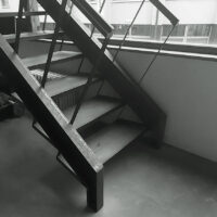
The tactile quality of the finish of the building is milder. The fixed furnishings are neatly constructed with a woodgrain finish. The stringers of the iron staircase to the attic are made from standard U-sections. Curved strips connect the wooden treads and the handrail in a single sweeping motion. The three-dimensional design of the strips would be almost impossible to draw. The strength and rigidity must have been just as difficult to calculate. But such strips can easily be made by a willing contractor when the client does not demand any certificates or other proof of technical performance. Welding could be done on site. Powder coatings were not required by the client/architect/inspector. Pre-fabrication, with its associated technical, logistical and administrative requirements and their impact on execution, was therefore unnecessary. Plain common sense prevailed and that was how the staircase was built. It must have cost a bit, if not in money then certainly in terms of effort and powers of persuasion to get this piece of handcraft built. The staircase is prominently placed in front of the façade window and serves a figurative purpose You do not simply walk up and down this transparent structure. The staircase is a showpiece in the De Smet Vermeulen offices that also gives expression to the firm’s building skills and intentions.
De Smet Vermeulen’s position in the design process for the crèche in Antwerp’s IGLO residential care centre could hardly have differed more from the ideal situation described above. The project was won in a design competition. Because there are no opportunities for interaction, this form of acquisition by necessity puts the user some distance away from the design. What is left for the architects is the formal planning of a set programme. Some exaggeration in the formal repertoire while adopting a radical position can do no harm in the adjudication process. In such situations the designer has a range of responsibilities, certainly including those of an entrepreneur who can do little but compete on the basis of the submitted proposal. Conversely, the client and the architect have a duty to undertake the award-winning design in good faith, in accordance with the submission.
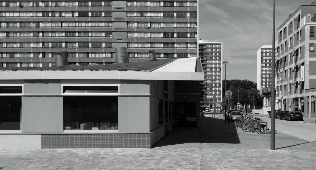
The accessibility required for child-care centres and the outdoor space around them makes it difficult to design anything other than flattened boxes. The clear articulation of the roof steered the project right from the outset. Yet the design looked rather different at the competition stage. A minimal upper storey provided the argument for a vaulted roof with a mushroom-like shape. Ideas about the urban planning and the building itself evolved during the planning phase. The plan of the building was ultimately almost square and supplied with an undulating shell roof. The six group rooms were clustered two-by-two around three patios, like rooms around a garden. The regular four-metre wide strip grid ordered the plan and the load bearing structure. Once again the diagram provided the most important typological and formal aspects of the design.
The roof gradually changed “from a mushroom into a flying carpet”,4 but continued to play a pivotal role. It introduced an element of variety in the proportions of the interior spaces on the one hand, while offering a “fifth façade” to the residents of the three surrounding high-rise blocks of flats, on the other. The project was built on the basis of a regular care provision budget and will be operated and depreciated in accordance with average norms. The contractor was selected by tender. This method prevents close interaction between the architect and the selected building firm, which means that priorities had to be set. The expressive concrete shell roof made it to the construction site. It was eventually constructed by using a system formwork. The investment in the roof pays off in every sense of the word. The three-dimensional effect of the roof breaks up the symmetry of the ground plan, for example. The group rooms on the south side have a compelling horizontal effect compared to the group rooms on the north side. This is reinforced by the different façade windows on either side.
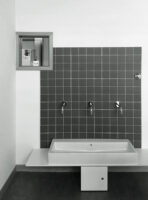
Windows, hatches, nappy cupboards, children’s furniture, acoustic absorption panels, skylights, sanitary facilities and frames for the works of art were all added to the rational canvas of the building. The colour palette is restrained and was used in a different combination for each space: a brushstroke that introduces an essential layer of attributes nestling between the design of the building and its use. The colours are curiously incongruous although the designer’s hand is not otherwise strongly manifest. It is an elaborate design that under the present-day reality of the construction site cannot be steered simply by means of the working drawing. Plenty of evidence is available in the building as realised. All these traces blend with the other additions to the plan for the building, along with those left behind by the children, their parents and the crèche supervisors.
While Aldo van Eijck in his Burgerweeshuis orphanage in Amsterdam declared the attributes of child’s play to be the underlying principles of his architecture, thereby putting dome tectonics into a different perspective, the opposite took place in Antwerp. Mainly because of the shell roof and the strip grid, the design of the building managed to accommodate a series of improvisations, necessities and negotiations without elevating them to the lyrical. In all senses, the building offers shelter. That shelter could perhaps be described as monumental. The performance of the building is suited for the children.
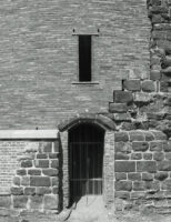
The restoration of the Maagdentoren monument in Zichem was based on a fundamental reading of the stone keep. The walls of the fortification had partly collapsed. Floors were suggested by the remnants of the stone vaulted ribbing. The remains of a stairway to the top were also discernible. Like a diaphragm wall before such a thing was termed such, the structure of the tower comprised an ironstone outer wall separated by more than two metres from a brick inner wall filled with lime-mortared brick and sandstone rubble. There was no prior programme for the restoration that was arranged by the Flemish heritage authorities in dialogue with De Smet Vermeulen and a restoration expert. The programme, design, budget and operating model were all agreed on as work progressed, which also helps to explain the sheer absence of imposed imagery to the design. There was no radical approach pursued by competing architects here.
The span of the medieval diaphragm wall was used to build a flight of stairs in the cavity. This was built as a two-metre wide concrete structure that anchors a thin brick shell on the outside, with new concrete vaulted ribbing on the inside. The shell is made from elongated Petersen bricks on a plinth of hand-made bricks with a simple prefab concrete sill. The contemporary materials were used in a way which is consistent with their own structural logic, as the example the architect Hans Döllgast once provided with the restoration of the war-damaged Alte Pinakothek in Munich. The concrete stairs and the structure of the vaulted ribbing were even more autonomously designed. The simple diagram of the fortified tower has been added to and functionally interpreted wherever possible and necessary. The stairway to the top leads to a newly constructed viewing platform for education and enjoyment. A layer of concrete has been applied to the uppermost side of the coarse historic masonry for its protection. The slender structure and pale colour of the stainless steel platform sets it off against this volume.
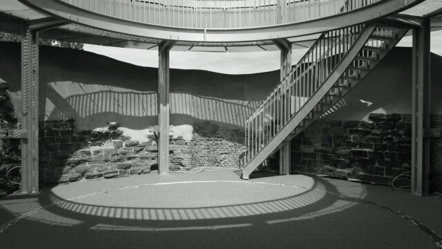
The interventions fit in with the structure imposed by the historic monument itself. They are clearly contemporary structures in their design and use of materials. This is consistent with present-day thinking on restoration in which the traces of time are apparent and reversible. Without archaeological evidence it is considered inappropriate to speculate about the ordinary domestic attributes that must once have been present. In the absence of historical certainty, additions are made legitimate only by considerations concerning their need and use in the here and now. The keep was to become a didactic tool.
This approach has a certain tolerance level. De Smet Vermeulen had limited formal authority during the building work. During construction there was an unexpected setback in stabilizing the keep. The bold steel, brickwork and concrete additions to the rough keep could be adapted as required without affecting the integrity of the design. The restored section with new brickwork was, in the end, bigger than had originally been envisaged. Slits to admit light were added during the work. The only reconstructed window includes typical De Smet Vermeulen details with metal lintels and sills recessed into the pointing that were not based on any historic antique precedent.

An accomplishment of the undertaking is that the ruin is no longer a ruin, but that an architectural form was sought which is neither new nor old, appearing to be have been led by formal considerations. More than in the previous two projects, the emphasis was placed on the purity of the typology and structures.
The diagram for the studios in Ghent forms part of the declaration of intent which is inherent to building your own studio. The shell roof in Antwerp played its part in the acquisition of the project through a competition and the negotiations about the design and programme thereafter. The opened-up diaphragm wall in Zichem provided the starting point for creating a new architectural design in consultation with the restoration authorities. These three examples demonstrate how the design work of De Smet Vermeulen operates in such differing domains. The architects recognize the inherent differences in the dynamism and what is important in each of these domains.
The diagrams of these buildings serves as an instrument for the acquisition and later specification of the project. It establishes the most important qualities of the building and its most stable properties in terms of typology, dimensions, structure and materials. That diagram is solid and resilient and needs to be too. The layer of attributes and colours is much more malleable and far more open to negotiation and accommodation of the modifications and setbacks that constitute an intrinsic part of work on a building site. It is difficult to imagine that the typological clarity and somewhat gritty visual quality of De Smet Vermeulen’s buildings were created in one single sweep. Does this suggest various forms of craftsmanship, indicating typological skill coexisting with pragmatic action?
That would be too simple an argumentation. It can certainly be said that De Smet Vermeulen’s work remains strongly rooted in the typological project of the past 50 years. The related canon quite clearly shows just how problematic the notion of representation has become and how typology and imagery have become different worlds. Aldo Rossi added melancholy personal imagery to the typological diagrams of his buildings. Oswald Matthias Ungers created a relentless continuity between the diagram for his buildings and their outward appearance through the use of neutral squares in both. Roger Diener and Giorgio Grassi are inclined to present the diagram in all its sublime starkness. Alvaro Siza, conversely, complicates the diagram itself only to render it in a minimalist but always personal manner later. The tectonics of the façade skin, the relief in the façade and its urban aspect were the themes of Hans Kollhoff.
However firmly the great builders of our time define their design methods, the notions of type and style grate as never before. How are projects materialized in the ever more complex processes of negotiation that typify modern urban development? How do we decide on form? Can the notion of style still be considered as something that people share, something that expresses common values and ideals? Or is style only an individual’s formal preferences? Or should style be considered merely a sophisticated compromise between conflicting intentions, a negotiated result? Is style, perhaps, connected with a project, a city or a context? Who, indeed, has ownership of style?
De Smet Vermeulen has adopted its own position in that array of forces. Not so much that the firm appears to drive a wedge between typology and its visual execution in an outward appearance or style in its work, but more through a particular appraisal of the relationship between these things.
To start with, there is the diagram of the building which shows a certain degree of exaggeration. There are easier ways to approach this. The huge façade beams in Ghent, the shell roof in Antwerp and the opening-up of the mediaeval diaphragm wall would have brought the financial and engineering aspects of these projects into sharp focus. There are certainly simpler technical solutions which could have been used. It is indeed the overstated quality of the design that gives it considerable architectural and urban persuasiveness. The diagram puts the building in just the right place, so to speak. It largely dictates what the building will look like and how it functions spatially. This capacity strongly diminishes the purpose and need for visual overstatement.
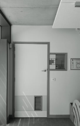
The other side of the design process is about the materials, the assembled building products and structures with all the imperfections that they come with today. That other side is also supplied with the everyday signs life of the city dweller. The texture that this gives rise to cannot be simply synthetic, glittering or shiny and represents little more than the activity of building and living in the city today. Perhaps this rough imagery reflects a longing for style, a style which is both as impersonal and as intelligible as possible, a formal repertoire that may – to the extent that this is possible – be shared in the multilingual city of today.
In the De Smet Vermeulen oeuvre there is always an undisguised relationship between the formality of the diagram of the building and the informality of its urban grittiness. While the design bears all the verve of a signature, the finish barely shows the hand of the author. The designs do not parade the craftsmanship on the building site and even less exhibit a nostalgia for lost skills. The practice moves from point to point along the process flow from schedule of requirements to drawing, computer model, tendering, construction site, handover and inhabited building. Paul Vermeulen puts its simply: “Henk and I decided at some time that we would leave the brickwork of our office unpointed. We were afraid that pointing would detract from the warmth of the bricks. It was not deliberate, not part of our plan, but at the time we thought it the best choice. We never really noticed that the builder did not actually work that carefully.”5
The decisions taken in terms of the diagram and styling of the projects in practical and architectural terms can be explained by an awareness of the reality of the financing, depreciation, exploitation, earning capacity and commissions, etc., that underpin the design process. This ensures that the diagram – in the context of the defined task – is made as stable as possible. The same awareness links the style to an ability to improvise. The ease in which they operate in different registers is the essence of the craftsmanship of De Smet Vermeulen, a craftsmanship that is nowhere more appropriate and effective than in today’s multilingual Flemish building practice.
Notes
1 – Christoph Grafe, Multilingualism, Design Methods and Aesthetics in North Western European Architecture, in: Architectural Review Flanders No. 11, Vlaams Architectuurinstituut, Antwerp 2014, p. 289 ff. Grafe never gets around to answering the interesting question of the design methods used in multilingual Belgium, at least not with respect to production aspects. The idealized representation of the notion of craftsmanship in this essay on architecture was generally selectively applied in this book. No large scale infrastructural or commercial projects, for example, were included.
2 – Herman van Veen (Dutch stage performer), Hilversum 3 (song)
3 – See also: Hans van der Heijden, The Diagram of the House, Architectural Research Quarterly, volume 5 no. 2, 2001
4 – Email from Paul Vermeulen to the author on 17 August, 2015
5 – Conversation with the author on 5 August 2015