


Molkenmarkt
Invited competition mixed used buildings and city square, Berlin
Client: Berlin City Council
2026
with Martens Willems Architecten, Kollhoff Pols Architecten, Christop Grossmann Architekten
If one remains solely within the realm of typology, then everything is both right and wrong at the same time. (…) Whether a door handle is made of plastic, bronze, brass or stainless steel makes a world of difference.
Hans Stimmann (1941–2025)
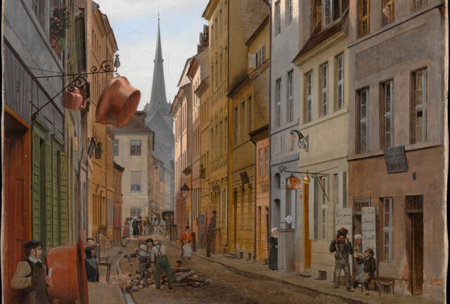
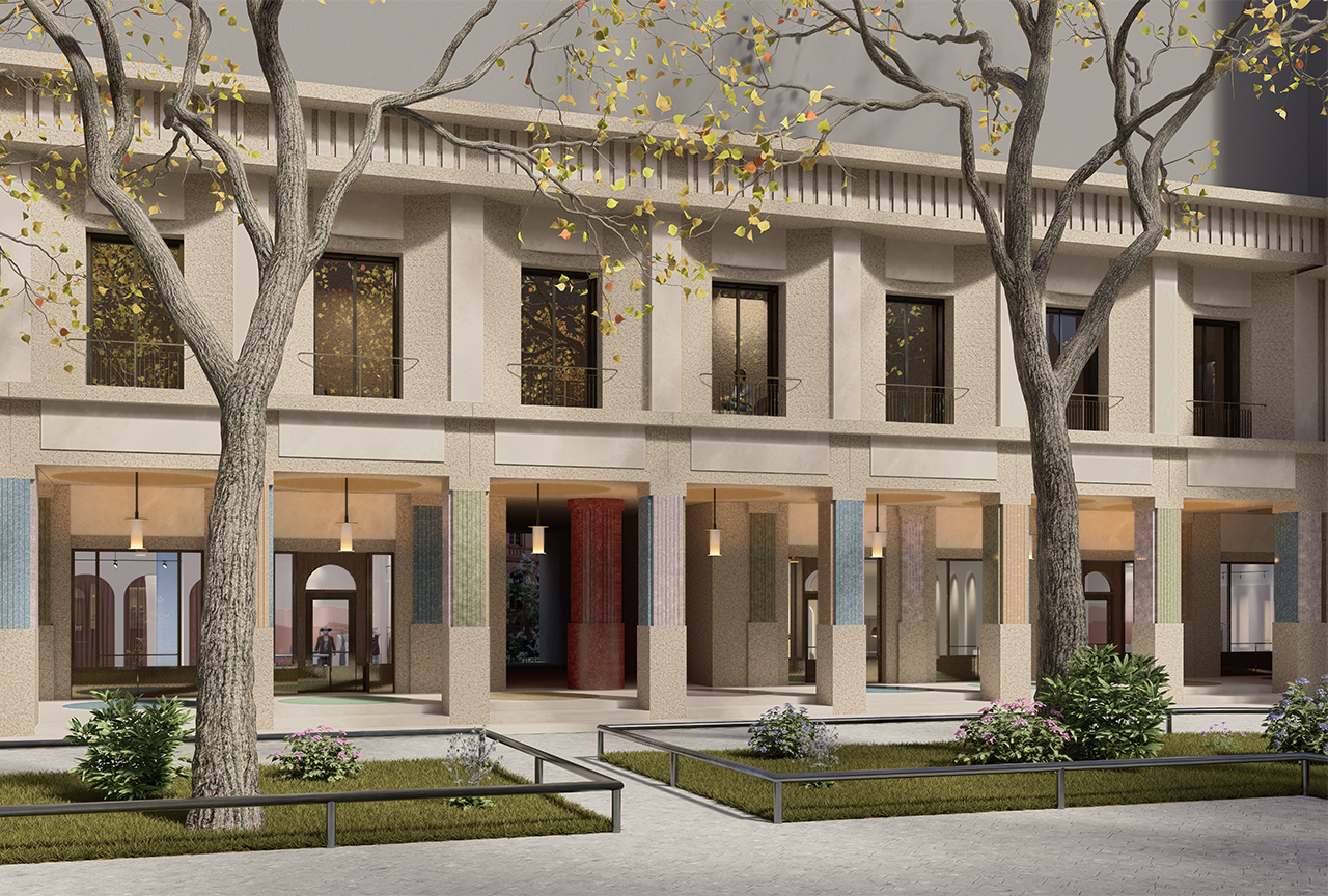
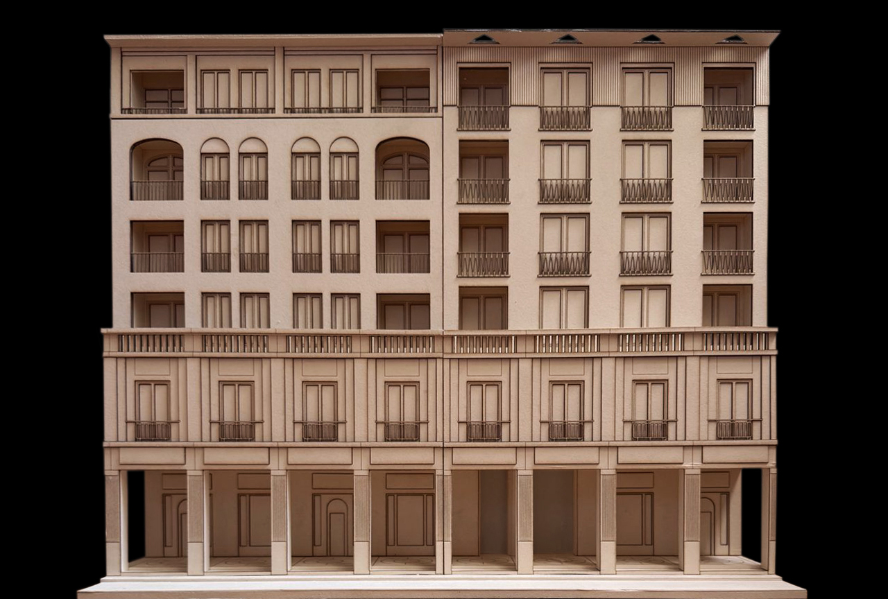
The new Molkenmarkt is to be experienced at eye level, but not with the eyes alone – with all the senses. That is why the urban repertoire is central. It complements the building’s form: the shop front, the gateway, the building’s entrance and the vestibule (or, as the Italians put it, the ‘androne’) must have an urban character in the city centre.
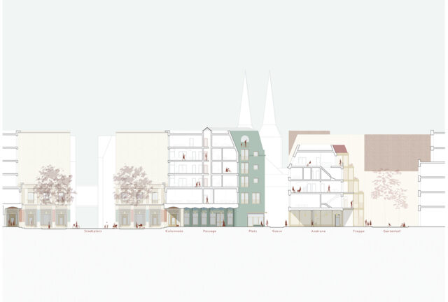
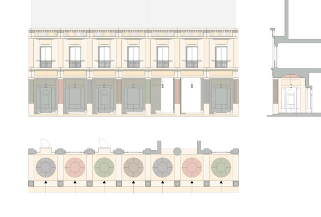
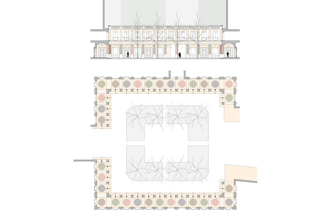
The project area lies between the formal town square with its colonnade, the narrow Parochialgasse which overlooks the Nikolaikirche, and the informal residential courtyard, the Gartenhof. In between, the urban elements are linked by a repertoire that organises the transition between public and private spaces. Depending on the setting, the urban elements are interpreted and emphasised in different ways.
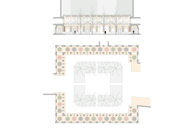
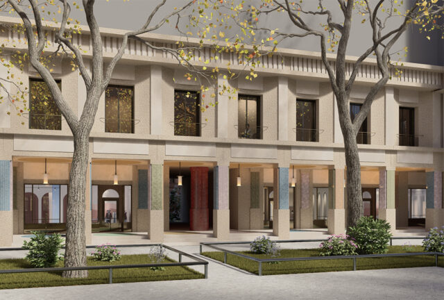
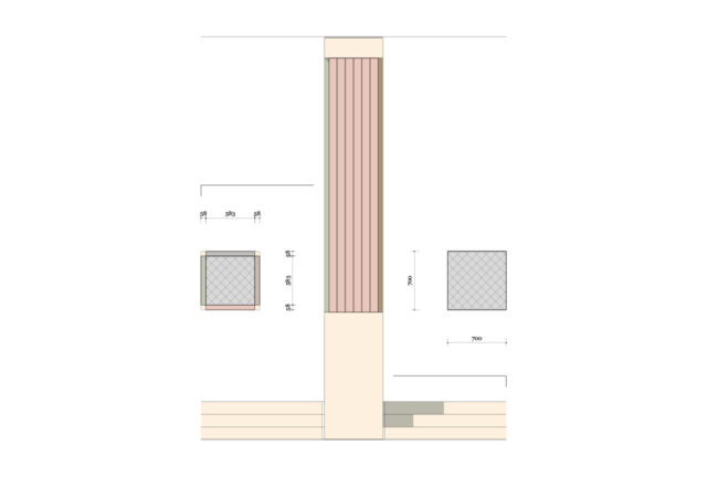
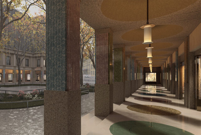
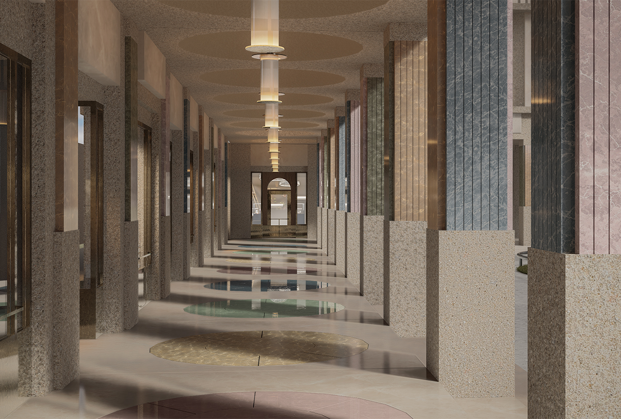
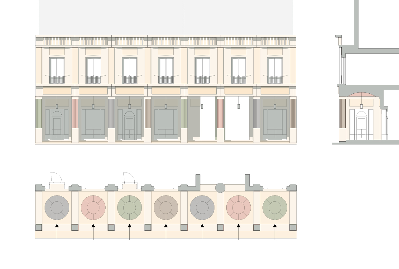
The colonnade is the most striking element of the urban repertoire. Like all colonnades, it is a space worth lingering in. The ceiling lends rhythm to the space and prevents the impression that the colonnade is intended merely as a quick passage from one place to another. The colonnade is not efficient. This also applies to its execution. Fragile lamps, typical of semi-public spaces, hang within the colonnade. Slender metal railings in front of doors and shop windows provide visitors with a handhold. The cream-coloured concrete columns are clad with coloured natural stone slabs. The proportions are borrowed from Doric columns, whilst the profiling is reminiscent of cannelures. Discreet colour variations on each side of the column help to break up the repetition and massiveness. The remaining parts of the gallery and the façades above it follow this material palette, with the natural stone slabs closely matching the cream colour of the façade panels. This creates a tone-on-tone effect that defines and shapes the square public space.
_